Background
Jim Payson is a master welder with many years of experience. In college, I designed Stationery for his welding business. During the intervening years, he completed many service calls to commercial buildings. During these service calls, Jim discovered a problem with most commercial doorstops he saw during his travels.
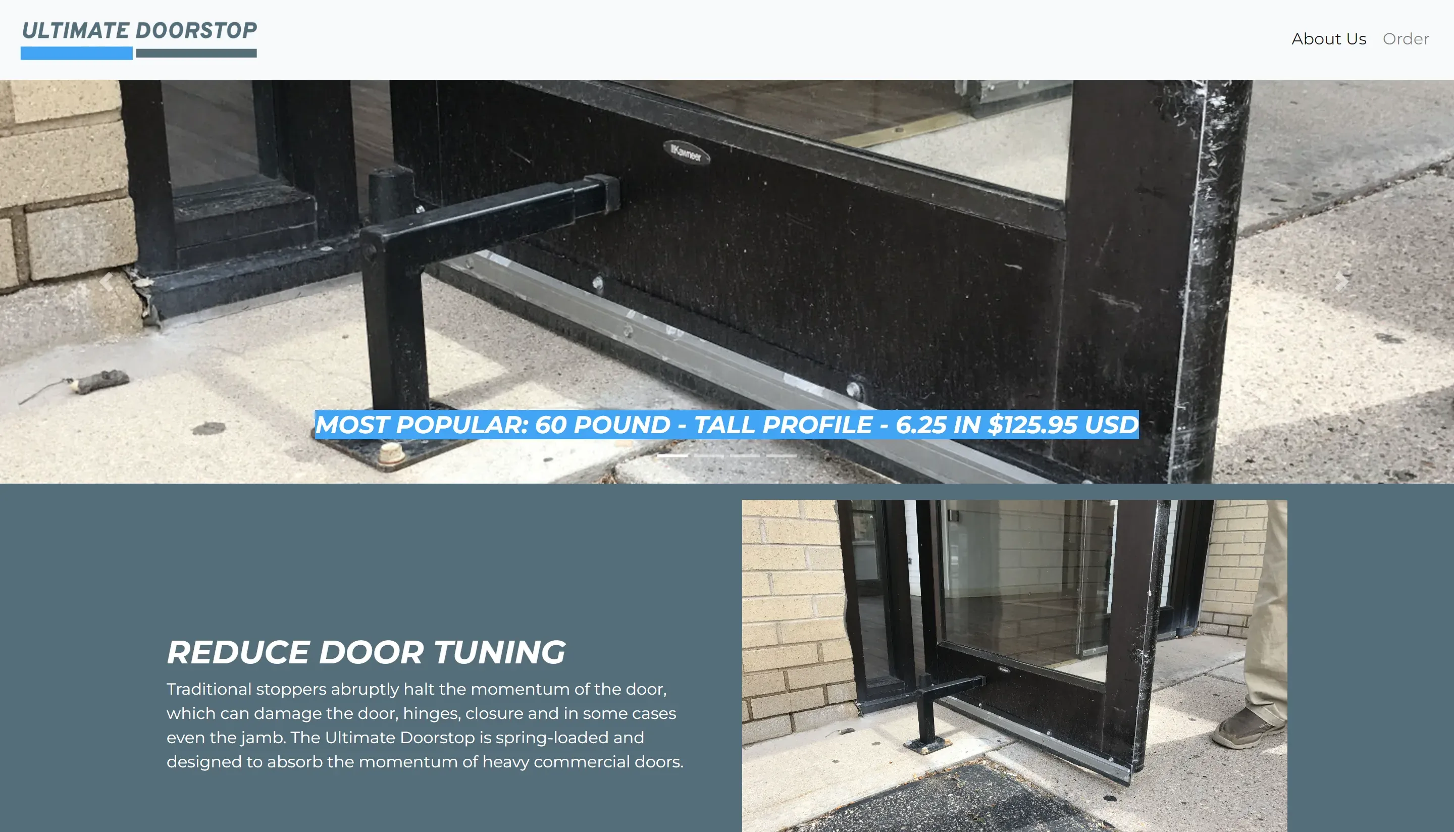
When we met, he explained that traditional stoppers abruptly halt the door’s momentum, which can sometimes damage the door, hinges, closure, and even the jamb.
Ever the shrewd businessman, Jim already owned a welding company but saw an opportunity to design a better doorstop. He machined and welded his initial prototypes and even got customers to agree to use them on their properties. He iterated on them and came up with something he was comfortable sending to mass production.
But first, Jim needed a website to sell them. He wanted a brochure website to drum up interest, where he could send people interested in pre-ordering the Ultimate Doorstop.
Objectives
This micro-site needed to clearly explain the benefits of his door stopper and be compelling enough for commercial real estate owners to be convinced to buy one for each of their entries.
Since the website would be simple, the content must be an elevator pitch for the product. The design needs rich content, including photos, videos, and well-written explanations, since the goal is to drive the user to the call to action of pre-ordering the Ultimate Doorstop.
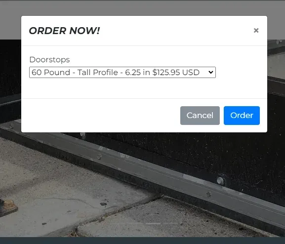
The main objective of the project was payment processing. I had not done payment processing before, but the site needed it. Jim had explained in our first meeting that he liked things simple, so whatever I picked needed to be easy enough for him to use without help.
Challenges
The initial challenge was crafting content for a brand-new product. Jim was the go-to person for all things related to the Ultimate Doorstop, but his schedule was full of other commitments. I knew I couldn’t spend endless hours in meetings with him, going over the details of the product. I needed to be respectful of his limited time.
From a design perspective, I wanted to keep the design simple, with a hint of motion. It should look professional and well put together. While I didn’t know much about implementing payment processing, I knew that site users would not want to give their sensitive information to a janky-looking site.
Finally, I needed to select a simple payment processing solution that Jim was familiar with or could quickly figure out. Again, Jim did not have much time or desire to spend on learning new payment processing software for a one-off site.
Solutions
While writing the copy for the site, I heavily referenced my notes, used my memory of the conversation, and got something on the screen. At that point, I sent Jim what I had as a draft so he could read it over in one sitting and give his feedback. This strategy limited the back-and-forth and gave us more time for other things: for me to begin writing the code for the site and for Jim to reach out to more of his friends and business associates to drum up interest.
When conceiving the site’s branding, I recollected a principle in design school that taught about the illusion of motion on a static page. For example, using italicized fonts to convey movement and progress. The site’s colors and angles evoke feelings of high technology, speed, and quality. It also needed to feel sturdy and anchored at the same time. I knew I could gain considerable yardage by choosing the right typeface. So, I selected a thick font with blocky stems, ascenders, descenders, and sturdy counters.
When picking the right payment processor, Jim’s immediate need to sell pre-orders of the Ultimate Doorstop was the deciding factor. That led me to look for options that didn’t require server-side code. Since James had used PayPal before for his main business, it felt like the natural choice; I configured it with the pre-order options he sent me and pasted the generated code snippet on the site.
Results
Jim was very pleased with how the site turned out and eagerly linked his customer base to it. Unfortunately, there weren’t enough pre-orders for the Ultimate Doorstop to justify mass production. However, Jim’s doorstops still protect the doors in the Tech Center to this day.
Lessons Learned
- The idea that you can plan for meetings to be productive doesn’t happen by accident. Walking into a meeting unprepared and disorganized is a good indication of how the meeting will turn out. Time is the most valuable resource.
- A font leaning forward implies motion. This concept is also positive in that it means progress and speed.
- Creating an effective MVP means achieving an iterable result. For example, since I used a snippet for PayPal, there wasn’t much buy-in for using that payment processor, only copy/pasted code; swapping out this snippet later when requirements demanded it is pretty trivial.