Background
After school, I got a job with an agency that prioritized not using CSS Frameworks and avoiding JavaScript wherever possible to achieve nice, smooth animations in CSS.
I had some spare time, so I decided to re-design the second version of my website using what I learned there.
Objectives
I wanted the new site to look clean, not use any frameworks, and be responsive to mobile devices. Textured backgrounds were popular during this re-design, so I wanted to incorporate them. Using what’s popular is less about following trends and more about staying relevant and keeping my skills sharp. Keeping current and up-to-date is a career-long pursuit of mine.
Another goal for the re-design was to showcase my current skills, code quality, and design experience. I firmly believe in putting your best work forward for a showcase piece, so I also wanted to try new techniques in building the site, like using jQuery for more interactive elements.
Challenges
Not using any CSS Frameworks was a big challenge. I had to develop my system of organizing styles. Then, I needed to understand where I could augment parts of the site with JavaScript.
I had not used much JavaScript until now, so learning to debug problems and diagnose broken interactions stretched me.
Solutions
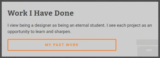
One of the design elements I used to showcase my skills was adding background icons to the cards on the front page. This effect adds sophistication to the design. Instead of a plain-looking three-card layout on the home page, the icons add flair and visual interest. Adding icons to cards was not as commonly used; in 2013, most people wanted their websites to look like Apple’s marketing site. So it felt fresh and different.
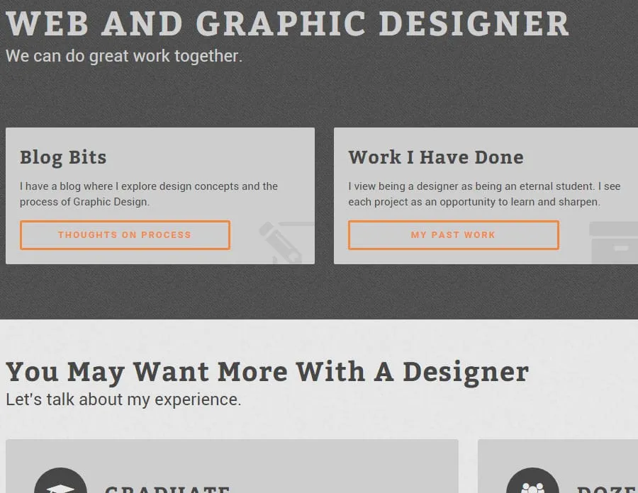
Hover transitions were another area that I added to delight the user. When hovering over a button, a right chevron appears to indicate directionality and forward progress. Hover effects are a challenge on mobile because you can’t hover anything. So, I used focused and active button states to add the icon for mobile.
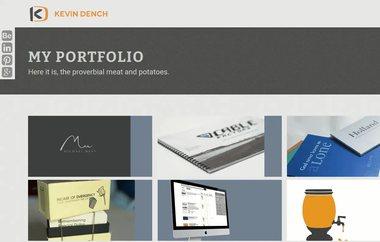
Along with hover effects, I added these to the images shown on the Portfolio page. They fly down from the top and provide two options:
- Visiting the project to see the case study on the work and thought process associated with the project from conception to implementation.
- Visiting a recommendation I had recommendations associated with specific projects, currently just the monogram one.
Clicking a recommendation from the portfolio page takes the user to the recommendations page. If I were to do this today, I would use JavaScript to measure the height of the sticky nav, add that measurement to the top of the recommendation’s starting point, and then briefly highlight the recommendation to show the user which one I am referencing.
Results
Between version 2 and version 3 of my website, there was a giant leap forward in quality. You can see how much I learned about web development in a short time. I graduated college as a graphic designer, and my first professional job was as a UI/UX developer, which required me to learn tools like SCSS, JavaScript, and PHP.
My role involved creating static designs in Photoshop and then implementing those designs on the web platform. Doing both the design and development taught me to be creative in Photoshop and made me think about how I’d write the code.
The design feels comfortable and demonstrates advanced skills for a junior-level developer.
Lessons Learned
- Hover effects on buttons can feel like progressing forward to a user, and if done right, offer reassurance that they’re making the right navigation choices.
- Background textures can enhance a design and make it feel less sterilized and static. However, overusing them can be detrimental.
- Creating a custom grid rather than a CSS framework taught me not to repeat myself as much in my styles.