Background
The University of Colorado student library, a knowledge hub, is crucial in serving the academic needs of over 30,000 undergraduate students.
As a college student, finding information on articles and papers on the Library website should be straightforward. As with any good UI/UX project, I talked to the users.
My research found that over 93% of students use Google Scholar and Google to find their information. This amount of attrition away from University resources was a problem since universities often shell out huge sums of money for access to scholarly journals. So, whatever solution I came up with needed to compete with the simplicity of Google Scholar. However, what simplicity looks like to one person may not be the same for everyone.
Throughout my user testing, there were many discoveries, but one of the most prominent was the type of information people wanted to see displayed. One of the most critical aspects of the library re-design was information digestibility. Through my user testing, I could test the new design on the original designer of the library site.
Objectives
I interviewed two or three people from university libraries to learn what they found important. I also discovered how library search engines work. Search engines index the text of the catalog data, especially the hand-written bibliographic descriptions. However, these kinds of searches don’t work like online web searches. You must know much more about what you’re looking for in a library search. Things like authors, journals, or publishers can confuse students new to this kind of search.
The goal is to make the interface much more familiar but not eliminate the advanced features users need.
Challenges
A search result is, by nature, information-dense. Organizing and presenting this information to the user is essential so that it is not lost or degraded.
Then, there is broad appeal. You’re dealing with a melting pot of perspectives, preferences, and priorities in a student body. These three things may contradict each other, and others may complement each other, so striking a balance is essential. User acceptance testing is crucial in an exercise like this. It’s a good thing I am going to a university!
I also decided early on that a complete re-design of the library product wouldn’t be appropriate. In this case, retaining the same good bones but freshening up the UI enough to provide a more digestible experience will be vital.
The site’s content did not have a clear typographical hierarchy. Typographical hierarchy is one of the best ways to guide the user’s attention and improve scannability—we all do it in a clear, structured way.
Solutions
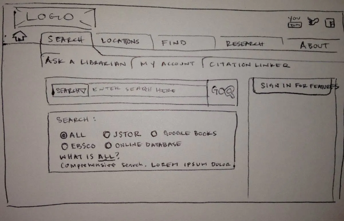
I started with a rough sketch of how I wanted to lay out the design.
In looking at the original site, the background images were distracting, so I removed them and used a white background. That helped from a focus standpoint.
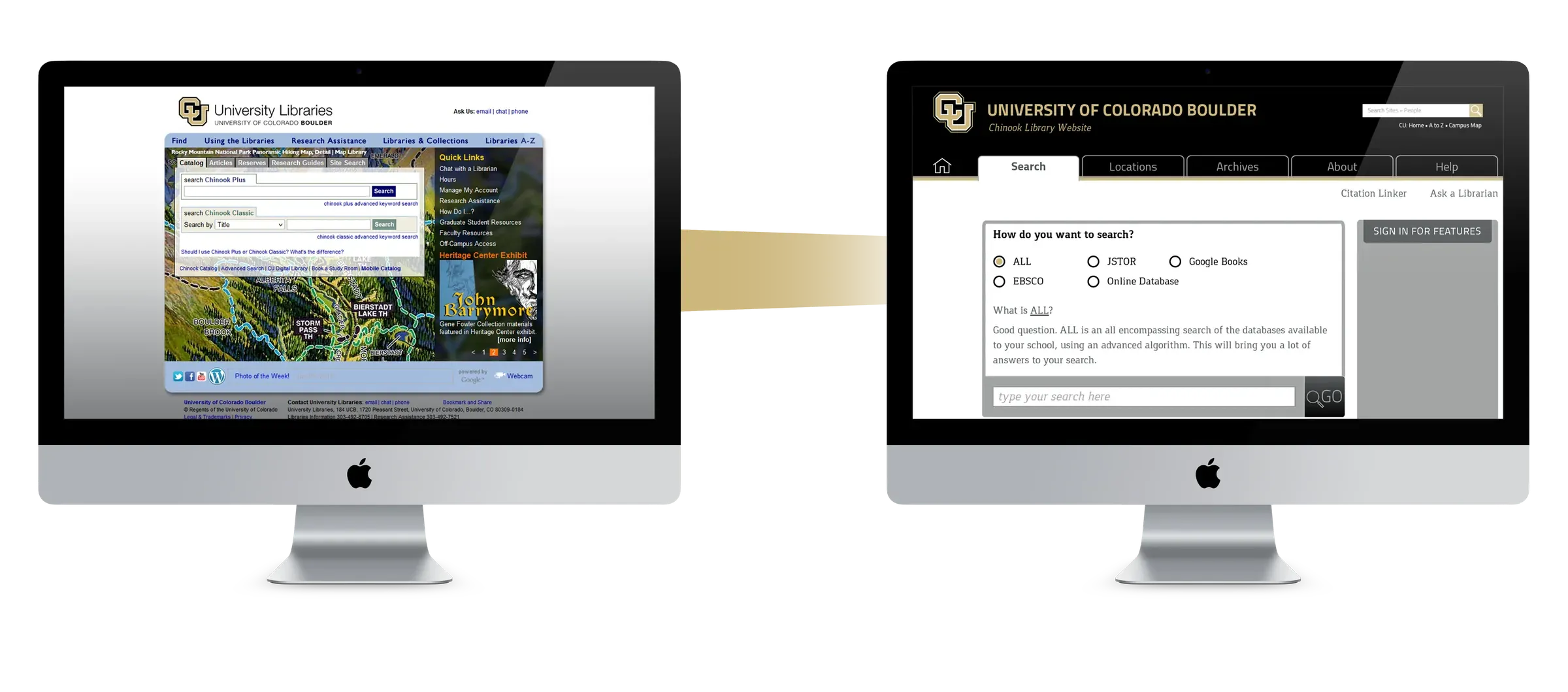
The other things I did behind the scenes were to enhance the school branding. The site uses a blue color scheme, while the university has a black and gold color scheme and a strong brand. I incorporated that strong brand presence into the final design and the typographical hierarchy.
Results
Overall, the change is pretty positive. However, there is still a lot to learn. When I talked to the original web developer, he had many questions about how things would function after I removed certain links and other bits of content. If I were doing this project professionally, there would be a lot more discussion revolving around the site’s use cases.
Lessons Learned
- Information-dense content must follow a typographical hierarchy to guide users through the data.
- Functionality and aesthetics can be the same, but functionality will usually dictate the aesthetics. Educating myself on the actual functionality of each page would have made the aesthetics not only beautiful but functional.
- Strong branding makes a big difference on a website or application.